Pantone, Solid as a Rock?
Pantone Solid Color books (part of the Pantone Graphics System) come in both Coated and Uncoated variations.
These physical books contain nearly two thousand colour swatches. For any named (or numbered) colour – the same very same ink formulation is used to produce both Coated and Uncoated book variations. For example, PANTONE Orange 021 C ink is the same as PANTONE Orange 021 U ink.
The visual differences in the swatches are due to the interaction between the ink and the surface substrate [paper, innit] they’re printed on. Uncoated paper absorbs more ink – and importantly the pigments within – than a coated (or other impermeable) stock. Hence colours look duller on uncoated paper.
The two sets of physical swatches from Pantone are produced so that we can choose the correct ink formula to produce the desired result on the chosen medium.
Brand guidelines may need to specify more than one Pantone colour for any individual key brand colour depending on different paper stocks. There is a common misconception that PMS is a standard for the final result across any media type. The results may be very similar for some colours but not all. Something to consider.
The Pantone swatch books are a very useful tool. They may seem expensive but you just need to consider the logistics of printing a 1,867 spot colour job. Yowsers. Go get your bad self some Pantone Solid Color guides. Or give me a call
Pantone Color Bridge. Too. Far.
Pantone also produces Color Bridge guides that convert PMS solid colours to their nearest CMYK equivalent.
CMYK process colours only match PMS 55% of the time.
However, unlike PMS solid colours, Pantone Color Bridge specifies different ink values for Coated and Uncoated swatches. Even more baffling, Uncoated values are less rich than Coated values!
“That’s a terrible idea.”
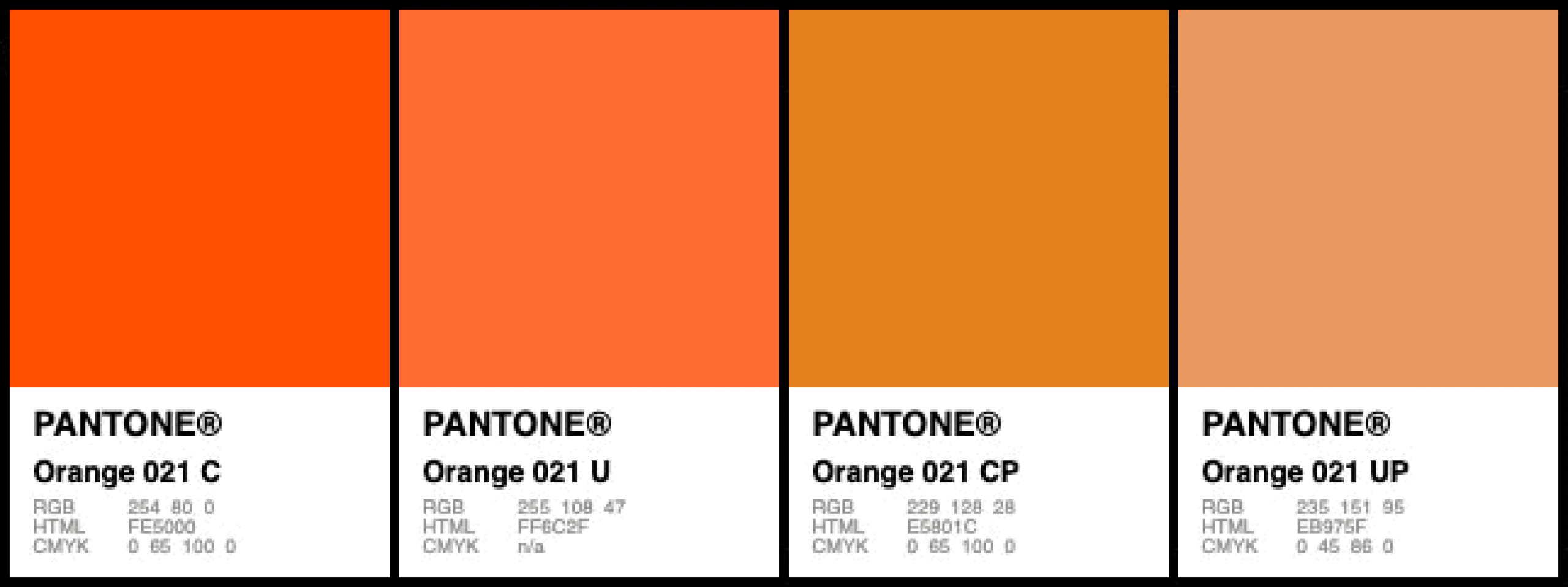
For example, consider PANTONE Orange 021:
- PANTONE Orange 021 C (Coated paper, PMS spot colour formula): 100% PANTONE Orange 021 ink
- PANTONE Orange 021 CP (Coated paper, 4 colour process inks): 0c/65m/100y/0k
- PANTONE Orange 021 UP (Uncoated paper, 4 colour process inks): 0c/45m/86y/0k
Look at that Uncoated Process mix above. It’s weaker than Coated Process mix. That’s upside-down.
So Beware! Choose the same Pantone colour by its number in Colour Bridge Uncoated and you may be getting a very inaccurate rendering of the colour you wanted.


11th August 2020 at 6:16 pm
Im wondering about your last point, its kind of confusing. You said the the uncoated is weaker then the coated. That ofcourse right. Since more ink is absorped the color is duller. Hence why the cmyk valures are different. But perhaps you meant it like, if its normally already weaker using even lesser ink on uncoated paper it will get even more duller
30th September 2020 at 10:08 am
Yes the coated paper should need less ink not more to produce the same result so I agree with the original comments. What is Adobe saying about this? It does seem messed up.. ! I hate these new books.. Are they meant for the cheaper generation of printers out on the market or maybe home printers that dont have colour engines .. ? Ya no thanks lol