It starts with exploratory sketches. Always. No computer drawing app is as quick or efficient as hacking out small thumbnail sketches. The sketches must be small – detail is the enemy – as the logo must be strong enough in its smallest essence. Then it’s time to polish the ideas. Add some left-field options for the sake of argument. Add opinions and bake in the oven for a week or so. In the end, it all comes together.
Elements considered for inclusion in the logo were the pride rainbow, a pride ribbon, a B4P monogram, a heart and crowns [kings and queens]. A disc is a dynamic signifier for casino chips and spinning roulette wheels/slot machine reels.

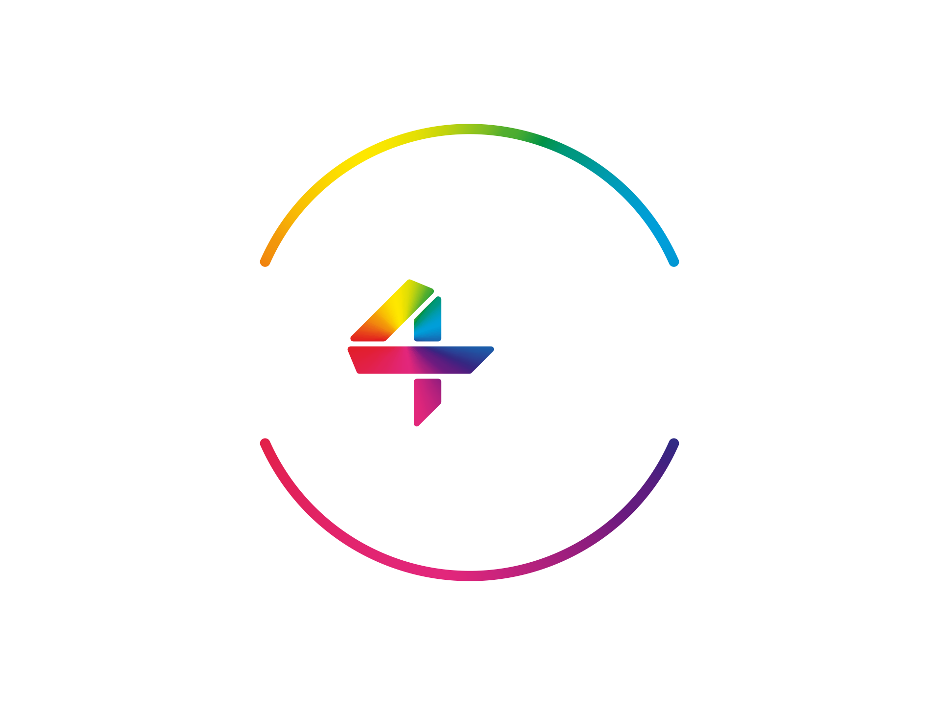
The final logo incorporates the pride ribbon as the central “4” of Bet4Pride. A full spectrum rainbow — rather than the banded, boxed-in colours of the original rainbow flag* — pulls together the ribbon with the outer disc signifier. The typeface is Uni Neue. It’s a lovely modern, lightly softened, sans-serif reminiscent of Helvetica but with a very 21st Century cut.
*Interesting to note that the original Pride Rainbow flag evolved with very pragmatic considerations – “these are the available fabric colours we can stitch together”…
Last updated on 5th March 2020


Leave a Reply