First problem beware the Pantone/Adobe swatch search box!
The first thing to check – is the swatch actually missing – or is it just difficult to find*…
There’s a long-standing, horrible, horrible bug in the swatch search field. Say, for example, you want to add Pantone 542, you’d assume that typing 542 in the search will filter it for you. You’d be very wrong. The search will take you to 5425 instead. To get to 542 you’ve got to manually go down about 130 swatches. [Of course, I’m sure different swatches will be at different offsets. You just gotta be patient and find it.] Thanks to this article about finding hidden Pantone swatches over on InDesign Secrets. From 2012. Oh my.
*We’re talking FML difficult to find
Now back to the issue of actually missing swatches…
Adobe CC apps come with what seems like a full set of Pantone colour books but they’re short of a couple of hundred swatches. Some of the brightest ones are missing. I’ve seen comments that Adobe supplied swatches are ten years out of date. If that’s right — then the answer to “how many Pantone colours are you missing” is 756.
Speccing a Pantone colour in your design software when it’s not available is kind of awkward.
It’s a bit of a slog to get hold of the missing ones. Nothing terribly onerous but set aside more than two minutes:
How to get ALL Pantone colours in InDesign/Illustrator/Photoshop…
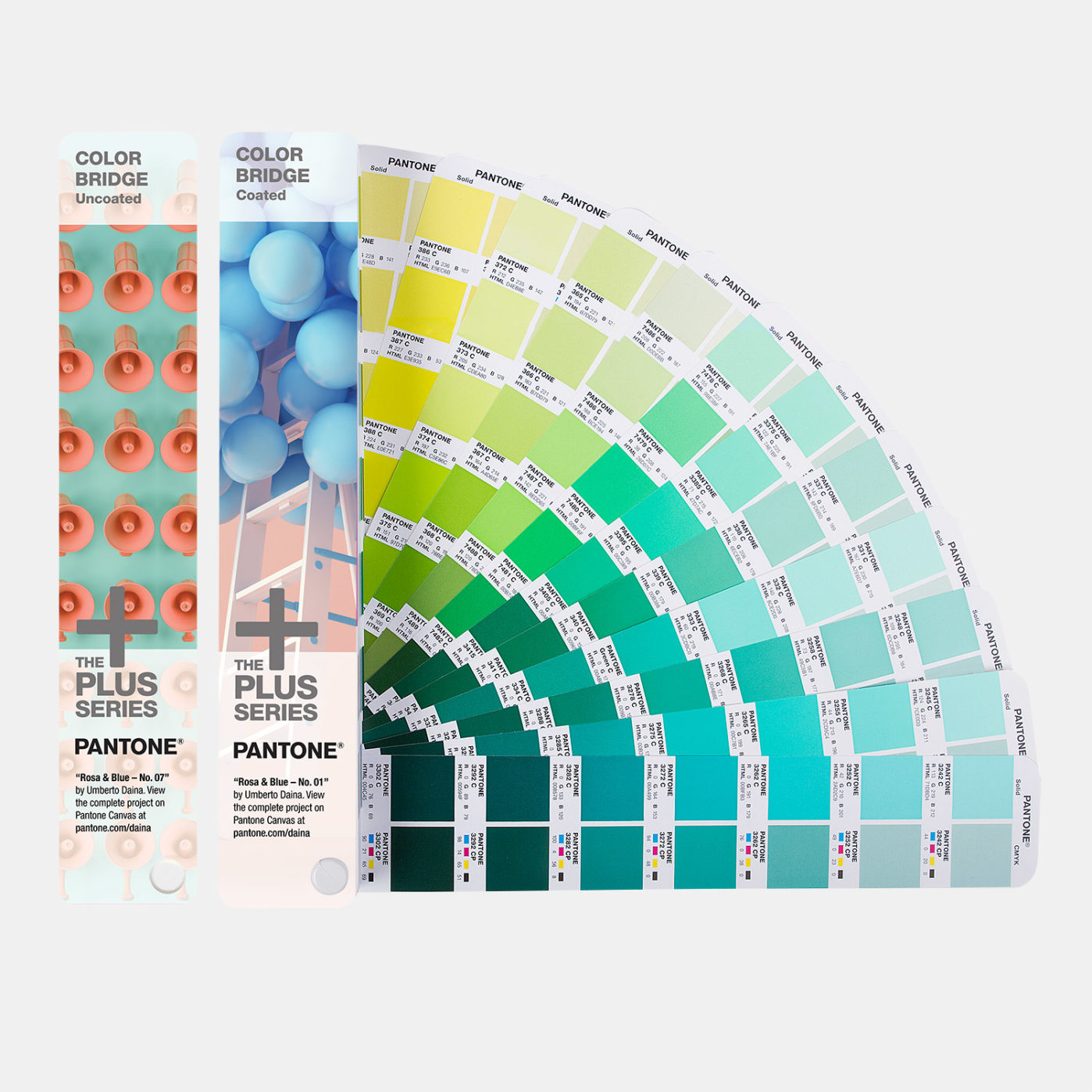
You’ll first need to install Pantone Color Manager. You’ll need a valid product serial number. Every Pantone swatch book has one. (You can also buy it standalone but there’s no value in that.)
So, assuming you have a Pantone swatch book already, the steps are these:
- Find its Registration Code (bottom of the second ‘page’ on Color Bridge books)
- Register your product at Pantone
- Download the Pantone Color Manager (PCM)
- Restart your machine [I know]
- Export each book you want in Lab colour (CMYK for Color Bridge) from PCM — separately for each of Illustrator, InDesign and Photoshop
- Find the swatch in the horrible interface as noted at the top of the page.
The 5th step is tedious but, in the end, you’ll have the full Pantone swatch collection available as well as the original incomplete libraries that ship with the Adobe apps. Look for the -V3 suffix, eg: “PANTONE+ Solid Uncoated-V3”.
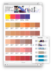
PCM Pantone V3 vs original Adobe-supplied Pantone swatch libraries
Couple of issues I’ve found with the new PCM “V3” colour swatches in InDesign…
On the plus side, PCM V3 colours show small on-screen warnings for spot colours that are beyond the display’s gamut.
However, Pantone PCM V3 versions are not as well integrated into the CC apps as original Adobe integrated, versions. Once set, you won’t see related Pantone swatches – or the search field – in the Swatch Options modal. You’ll see converted values.
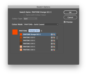
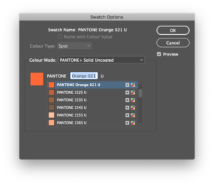
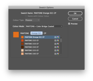
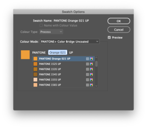
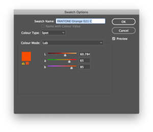
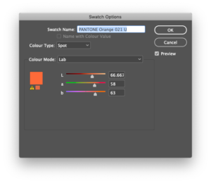
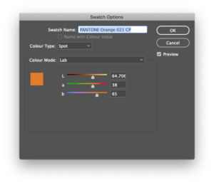
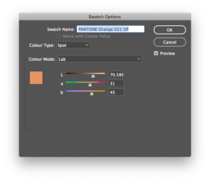
More confusion… Pantone PCM V3 versions display colour values. In the case of Color Bridge (CMYK process), these conversions are very different from the original versions. Have a look at the screenshots below showing PMS Orange 021. This matrix shows the original Adobe-supplied Pantone colours swatches against the new PCM exported V3 swatches: as solid and process; coated and uncoated. The differences are massive in the process versions (InDesign CC 2019, v14.0.2):
Spot vs Color Bridge vs native CMYK
Real word results must be considered when speccing colours. There’s a big variety of vibrant greens and oranges available in spot printing that just aren’t possible in process. This is where I personally find Color Bridge conversions to a problem. They give you a conversion where there is none. CMYK can’t print vibrant greens or oranges (nor plenty of other colours too). I find Color Bridge adds an element of confusion by offering non-existent parallels.
I understand that it’s necessary to have different unique(?) conversions for all the Pantone colours. People will spec different, similar, colours and need them to convert as different colours when converted to CMYK.
But…
Perhaps a third conversion is necessary. Add a big red X [?!] where CMYK can’t even think about going – and offer a third match in terms of vibrancy. That’ll be a lot of oranges that point in the direction of C0/M60/Y100/K0, greens that point in the direction of C60/M0/Y100/K0, etcetera.
In the meantime, where budget or application doesn’t stretch to using spot colours – consider finding your own process colour variant.
See also Missing Pantone Colours? (Adobe Forums)
Last updated on 4th June 2020

7th January 2020 at 4:04 am
OMG! Could they make it any more difficult to use their product. WTF?
5th March 2020 at 6:35 pm
Followed directions and 542 is still missing !!!
5th March 2020 at 7:04 pm
Hi Becky,
I just had a look and couldn’t find it either. Fished about on the internets and found that there’s a bug in the search box. It’s there but you have to scroll to find it. For Pantone’s Sake, right?
Type in 542 in the search box – it’ll take you to 5425, right? Click down about 130 swatches (!!!) and with a bit of luck you’ll find it. Grrrrrrrrrrrr.
Hope this helps!
3rd June 2020 at 8:54 pm
I still can’t seem to get a complete color bridge export in Illustrator. Beyond frustrated. The only work around I’ve found is to open color manager separately and drag and drop the swatch!
4th June 2020 at 3:02 pm
Hey Justine,
How frustrating!
Something to consider, maybe…
Something I found out after I first wrote this article is that for some swatches – it’s not that they’re missing – they’re just very difficult to find. This is due to a nasty bug in the swatch search box that dates back many years.
I’ve just moved that rather important info to the top now (sorry I thought I had rewritten but the update got forgotten in draft).
I’d not thought of using the Colour Manager work-around – thanks for that – nice fix!
24th June 2020 at 7:36 pm
Hi
I updated my version of Indesign this morning, now the following Pantones seem to be missing, Pantone 121 C – 129 C?
I tried searching for them, but they have just disappeared from my swatches?
Please advise
Kind regards
Mishkah
28th June 2020 at 8:35 pm
Hi Mishkah,
Sorry for the late response. (It’s was a very bust week at work!)
I’ve just had a look and this issue seems to fall under “terrible UX” issue of the swatch search box…
You can’t find them using the search as for some bizarre reason it auto-completes 121 as 1215, etc. Totally ridiculous but the good news (hmmm) is that they are there to be discovered. On the current macOS build of InDesign, 121-126 C are found by paging down 14 ‘screens’ of the New Colour Swatch interface in InDesign. YMMV but basically when the search doesn’t work you have to carefully page down and look for the number you need. Breathe deep and relax.
An alternative is to subscribe to the official Pantone Connect app. I had a look but was left underwhelmed.
17th June 2021 at 4:03 pm
Super helpful article thanks!
26th July 2021 at 10:38 am
Thank you very much. It all looks so simple now.
24th March 2022 at 1:02 pm
Pantone Color Manager has been discontinued as of December 31, 2021. All technical support for this product will cease on December 31, 2022. We apologize for the inconvenience.